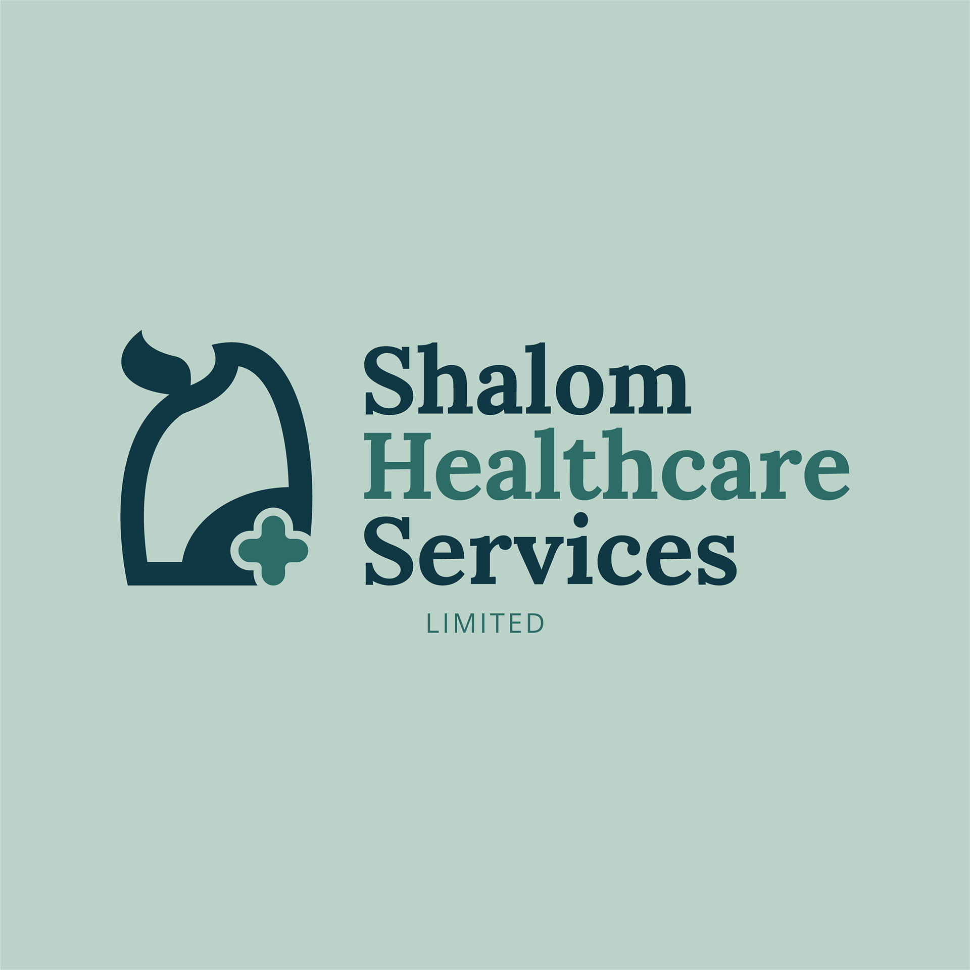
Shalom Healthcare Services is an upcoming Domiciliary care agency that is founded on the principle of "Wholeness." While many see healthcare as simply treating an illness, I aimed to view it through a more traditional lens.
The Design Origin:
The core of the logos visual identity is rooted in the history of the Aramaic language, the ancient lingua franca of the Middle East.
I drew inspiration from the letter Mem (מ), which historically symbolizes "Water" the source of life and healing.
The stroke of the letter to takes on the silhouette of a person. This representing the agencies "People-First" philosophy; at the heart of every service we provide is a human being deserving of dignity.
The curves of the letter of it used to encompass and protect the universal healthcare symbol, the cross. and by nesting the healthcare plus sign within the "arms" of the character, the logo represents a care agency that wraps its patients in professional medical excellence and compassion.
Below are some UI assets for the Website currently in development


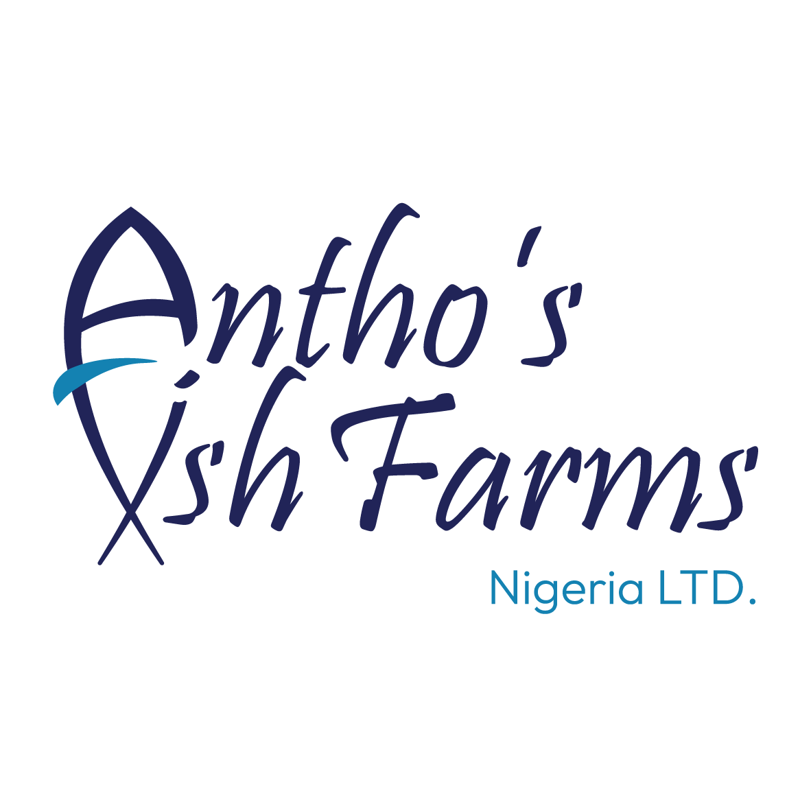
Antho’s Fish Farms blends traditional Nigerian warmth with modern aquaculture.
The Design Origin:
The logomark intelligently integrates the letters "A" and "F" to form a stylized fish, symbolizing growth and connectivity. We selected a fluid script font to capture the vibrant, rhythmic energy of Nigerian culture, ensuring the brand feels both organic and established.
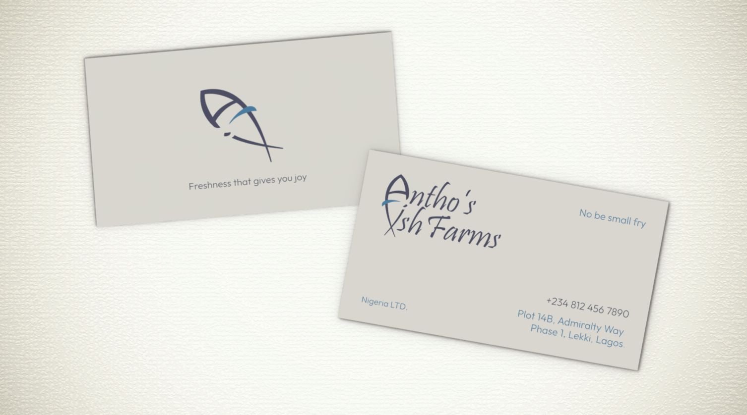
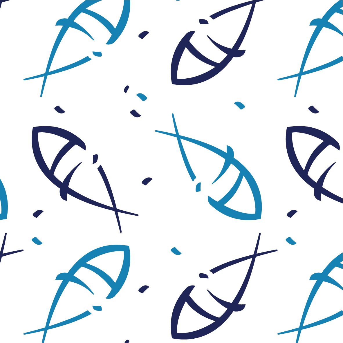
There is a mock business card and pattern below.